The design has much more impact than you think. That’s one of the first impressions the viewer has right off the bat. Does it bring out a certain emotion, does it look good, and is it functional? You don’t have to be the biggest creative in the world to come up with a design. However, you want to stand out from everyone else and create a certain identity that people understand is completely you. With that being said, here are 15 different ecommerce website designs to inspire you.
Threadless
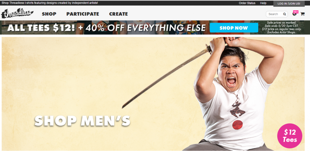
The thing about Threadless is that the design is very simple but the boldness of it screams young and adventurous. That’s the whole point of this site because it’s by the people and for the people. This is one site truly caters to the independent artist. A lot of the designs on threadless are by different artists. Sure, there are different spots like Zazzle, but this has a bit more originality to it. Currently, you can see that all the tees are going for $12 and the other items have a discounted price of 40%. The picture is great because he’s marketing a ninja-like tee and he holds a katana with a certain tenacity that says “buy me.” It fits in with the energy of the site and it captures your attention right away. A 18-30 year old demographic would definitely pick up on this and end up buying.
Concepts
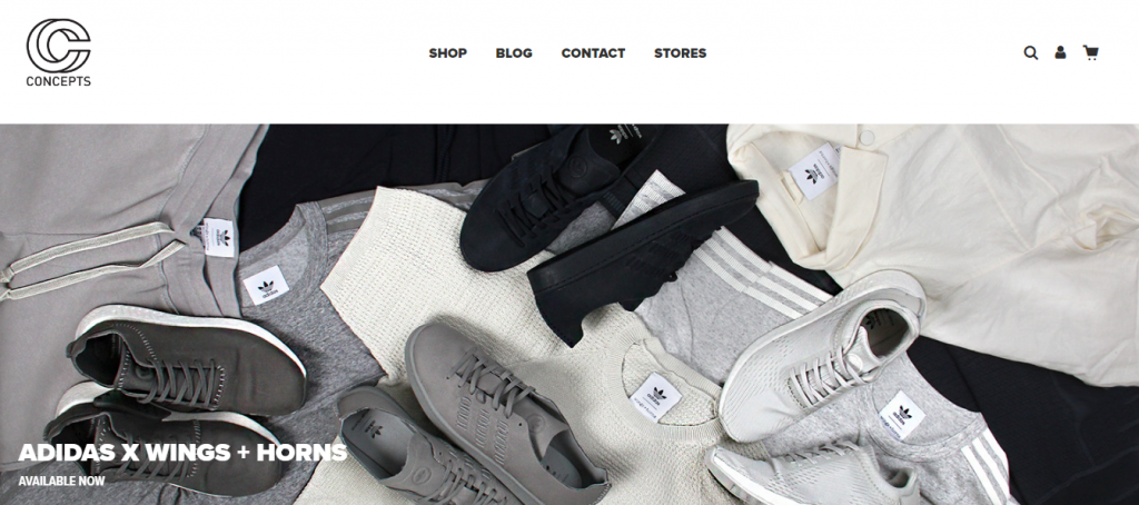
From the name, style, and logo, the site truly speaks for itself. It’s a solid clothing site that has a lot of great footwear, jeans, jackets, and more. The thing that makes this site pop is through the lookbook feel. If you’re going to a site that has fashion on the mind, you want something that says clean and sleek. Concepts is a great store from just a brick and mortar point of view. The website is just an extension of that flavor profile. The images are sharp and well-put together with different color palettes. Even though this design is a bit more simple, they always change the main imagery of what’s new in their store. This should inspire you to change things up a bit and keep the avenue of freshness on the runway.
FiftyThree
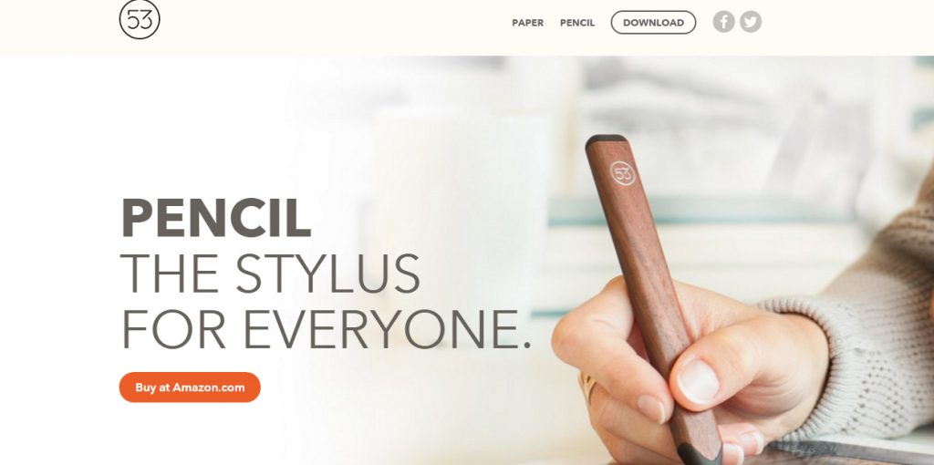
Bold and crisp all together in one image. The design is very cool and shows off a technological instrument to use with your phone or mobile device. This design inspires you because it gets straight to the point by presenting the main product in good form. The person holding the “pencil” has good form. The product is shown with the strong wood tone and it has the “53” logo right at the bottom of the product. It shows the pencil and paper form right at the top with a download link. There is a certain statement of power being shown in the picture especially with the message saying it’s the stylus for everyone. It’s a perfect lead-in for the product and will entice people to buy into it. Simple but effective execution for helping to get more notice through a direct product placement.
Kutoa
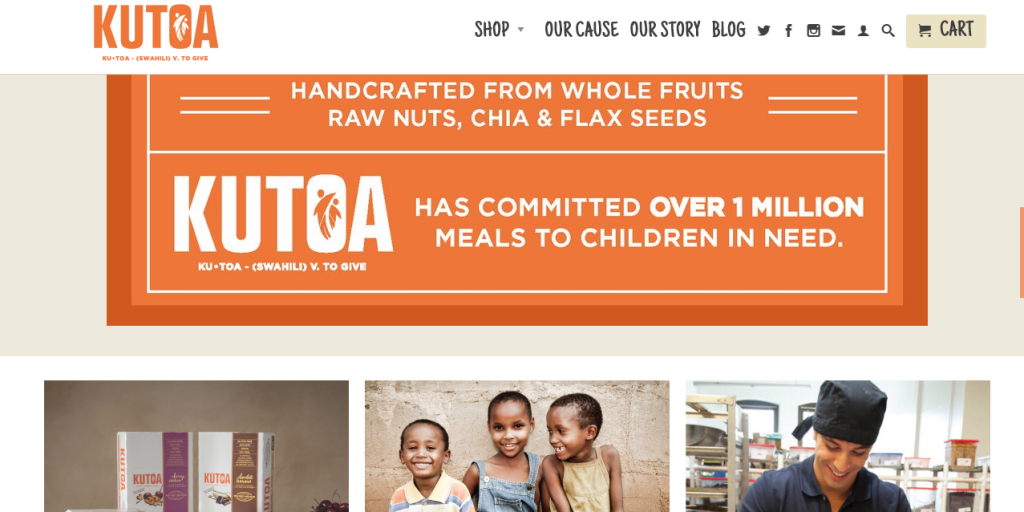
A bit of a standout design with multiple options to choose. Right from the start, you’ll see the orange which draws your eyes right into the site. Also, the logo is a great touch because it has a meaning “to give.” Ultimately, part of the goal is conscious capitalism. They have committed to over 1 million meals. Additionally, things are more health-based with handmade food from fresh ingredients. You get a piece of their story and why they do what they do. You’ll see the cause of helping young people and how it’s all about giving them something healthy to nourish their bodies, not malnutrition or other ailments. Very good concept and it’s important to showcase these kinds of designs because it helps to inspire others to give time or donate towards a great cause.
Au Lit Fine Linens
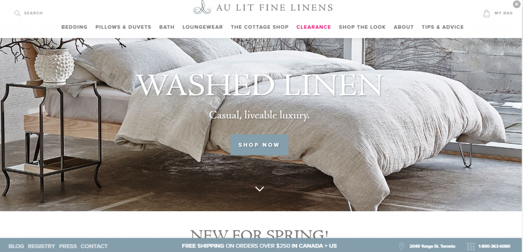
Luxury. Point. Blank. Period. The site gives great inspiration as far as having a sense of classiness and elegance. The picture quality is amazing because you can really see the detail in everything from the way the linen looks to how the room sets off the color. The search bar is easy to get to because it’s literally to the left of the title. Also, you can click the shop button right in the middle of the picture. Sometimes all you need is something that looks very clean and not littered with a bunch of flash images and over-the-top designs. People tend to gravitate towards that because less is more.
Natural Force
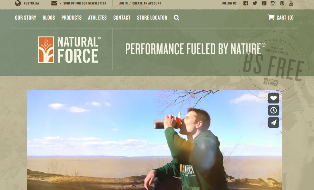
This is another bold and refreshing design. It has the nature undertones that makes it feel more on the outdoor side. It encourages you to buy product to help your performance during your workouts or any athletic activity. Even the Vimeo video is well-placed with the still image of someone out in nature drinking the formula. It’s the small detail like this and the refreshing feel that gets people to buy. It’s also inspiring because it makes you want to perform at your peak condition. A no-frill design is perfect for helping people get straight to buying especially when the product speaks for itself. Sometimes the more to the point you are in your conviction, the more successful your site will be in the long term.
Twelve South
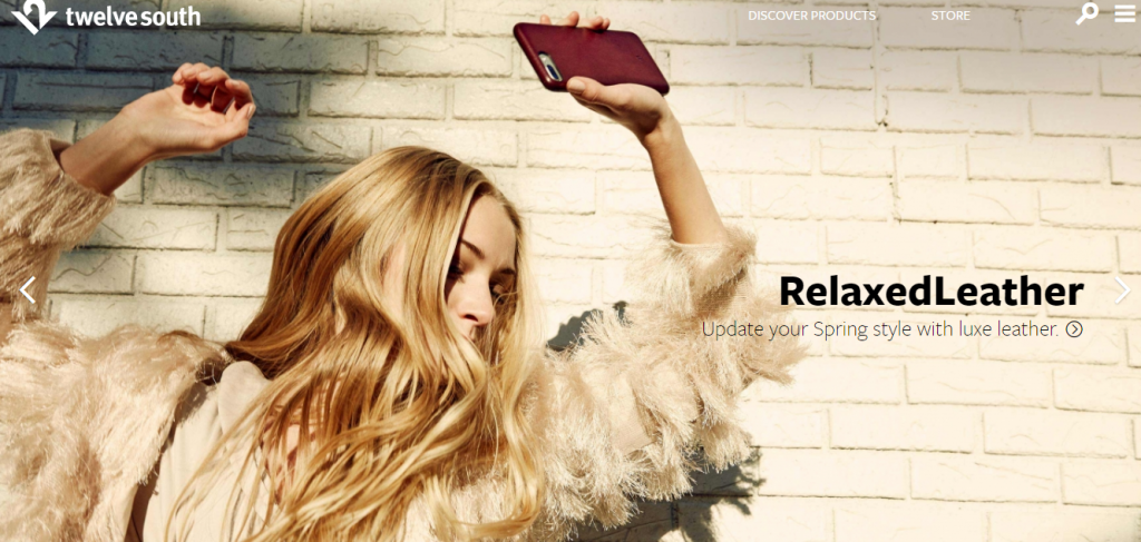
A very unique and classy vibe. For some sites, all it takes is one powerful image to make a statement. Here’s someone who looks powerful and in touch while holding up a luxury leather case for her iPhone. It’s not about the logo and overdoing it. Sometimes, it just the quality of the product. The way it feeds off in the picture should speak for itself, anyway. This shows that women are strong, beautiful, and hold a sense of class. It’s the perfect way to strike a specific demographic without taking away from the product. It grabs your attention and makes you want to find out more about the brand.
Abel & Cole
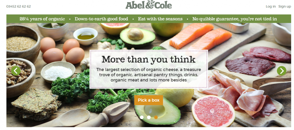
One word describes this site: fresh (figuratively and literally). Already from seeing the site, you see the fresh fruits, vegetables, and eggs. A lot of people take health for granted, but it’s also important to have something tasty. People think that you just need to eat rabbit food to keep a clean diet. However, fresh ingredients and quality seasoning works well for the body, too. People already build up an appetite with the colorful look of the site. Also, the lettering is clean and a bit unique. It has more of a flavorful style that just enhances the overall theme of the site. Fresh is good for the soul but also great to keep people on the site much longer. You can get a lot of great ideas just from the colors and the fonts.
Faucet Face
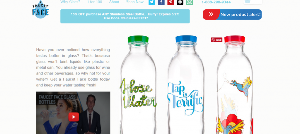
Another great design that focuses on simplicity to get the job done. Right from the start, you see the whole basis goes into describing what the product is about. Keeping water clean and fresh is very important. Plastic bottles aren’t the best material to put any drinks in. Water consumption from a glass bottle is a bit pricier but it’s much better to ingest. These custom bottles are great because it’s a bit more personal. Additionally, you can reuse the bottles for long periods of time so it’s actually more cost-effective. Whether you’re out and about or in the comfort of your own home, you want to have a refreshing drink that you don’t have to worry about spoiling when out in the hot sun. This goes to show that a simple and effective product can greatly enhance the quality of your life.
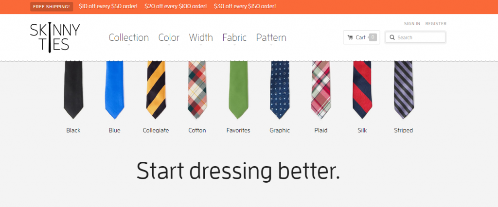
Skinny Ties
Modern, class, and fun all in one go. That seems to be the trend these days as technology adapts. When things evolve or change, that goes accordingly with everything else. This site from the font, design, and even the title screams a modern motif. People want choices that are easy to get. It’s the same thing even when it comes to dressing. They want something dependable but still stylish enough to get ready for a day of work, a luncheon, or a night out on the town with friends or a significant other. Businesses can take note that you don’t need a lot to maximize a particular niche. The most effective thing is keeping it simple but vibrant enough to attract others. A custom package with a variety of colors and character helps to give your patron an edge in their daily life.
Longboard Living
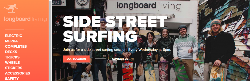
Cool and diverse. The design is perfect for the teenage to late 20s demographic. Also, there’s an emphasis on multicultural backgrounds. A good brand wants to pay attention to not only the niche but get some mass appeal. Longboarding has become a very popular sport to those youthful. It’s fun, exciting, and gets people together. The site has that same feel due to the beautiful pictures and overall vibe of young and vibrancy. From a lifestyle perspective, this is a theme you should go with if your business is based off promoting a way of life. Bringing a community together is another goal that should be under your belt. You want to create more than a business, but a movement that can last. Keep this in mind so you can sustain a great business that stay around for the long haul.
Bold & Noble
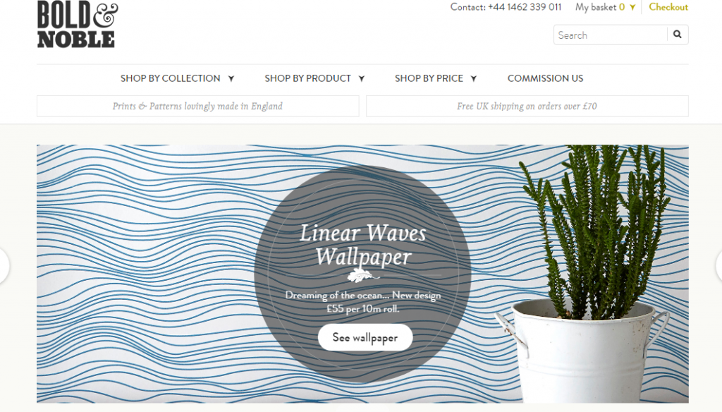
A beautiful and sleek design is sometimes all you need to capture your audience. It doesn’t always have to be out of the ordinary. Look at the way the wallpaper texture looks. It gives a relaxing feel like being by the ocean. It’s important to take a load off sometimes and enjoy your environment. Think of how someone goes to the site and instantly they get a sense of relief and enjoyment. Seeing the plant, the wave of water in the background, and all of that makes them want to buy a product just off the strength of the experience. You can help them buy into the fact that they can take this piece and make it a part of the home. At the end of the day, a person wants to feel peace and tranquility after a long work or school week.
Pop Chart Lab

It’s important to have balance in your website. By creating an atmosphere that has a beautiful design with a functional navigation theme, you give your clientele the best of both worlds. You catch their attention, but you don’t draw them away after the initial eye candy has diminished. In business, you want a bit of everything to really meet upon all levels. This way you can cover the bases and it’s harder for your competitors to pinpoint any weaknesses. Just like if you were training for a cage match, you want to have good striking techniques (the colorful/flashiness of your website that catches your potential client’s eyes) and great ground/submission moves (the content and product that actually bring in revenue). Take this site as an example of how to do it correctly.
What are some sites that inspire you daily? Have they given you great ideas to help you create a killer ecommerce website? We would love to hear your feedback on how different sites made you think a different way. Please drop a comment below.
When thinking of a redesign, this is a great list to get ideas from.
If you cant beat them join them. There are many great ideas here that can inspire you.
The skinny ties site is really simple and clean. These days that is really what seems to be best. You really don’t want a cluttered site.